Plain and Beautiful: A Younger Artist Considers Warren Rohrer
By Douglas Witmer
Essay published in the book Field Language: The Painting and Poetry of Warren and Jane Rohrer, ed. Julia Kasdorf and Christopher Reed. Copyright 2020, The Palmer Art Museum, distributed by The Pennsylvania State University Press.
The book was published on the occasion of the exhibition of the same title at The Palmer Art Museum.
I was an 18-year-old freshman art major in the spring of 1990, wearing an uncomfortable blue and yellow vinyl raincoat on a gray day in Chicago, when I first encountered the paintings of Warren Rohrer in a gallerist’s booth at a vast art exposition on the Navy Pier. There, up against the western edge of Lake Michigan, I was far removed from the place I came from. I was about to learn that these paintings came from almost the exact same place.
I grew up in Lancaster County, Pennsylvania, a sheltered Mennonite boy who demonstrated a talent for drawing and painting. A few years earlier, my art teacher had taken me on a life-changing visit to the Philadelphia Museum of Art, where I stood before Franz Kline’s Torches Mauve (1960) and felt the visual power of abstract painting. My goals solidified in that moment in a way I understood at the time to be a higher calling. Abstract painting was what I would do. I believed that I, too, had something important to put into the wider world. And in that same moment, I painfully sensed my known world would not recognize its significance. Full of creative moxie and blind ambition, I set my sights on pushing into a bigger world beyond, but was absolutely ill-equipped to do so, and would need to work against the pressure of the expectations of my upbringing. Upon graduating from Lancaster Mennonite High School, I was accepted into the Tyler School of Art in Philadelphia, but with a healthy dose of parental encouragement, I chose to attend a Mennonite college instead. Given my options, Goshen College in northern Indiana, considered the most liberal Mennonite school at the time, seemed like an escape.
Standing in front of Warren’s paintings I felt that I fundamentally understood them. Surfaces covered in myriad individual strokes of splendid color, organized in a disciplined way that taken together created a unified whole. A movement within the frame of each canvas that undulated but was contained. A pushing outward of light combined with the gravitas of settlement and resolution. A quiet sense of freedom bound reverently within painterly tradition. I didn’t necessarily take away a specific reference to the landscape of Lancaster County in that moment, but I recognized the feeling of being in the changing light and air of the outdoors. I felt an energy from the tensions of my upbringing distilled into an abstract painted image.
All of that was before I asked the name of the artist. Warren Rohrer. I recognized it instantly as a Lancaster County Mennonite name. And sure enough, I soon found out he grew up in Smoketown. Maybe his family mailed their letters at the post office just a mile down the road. Postmark: Witmer, PA.
I spent fifteen dollars (all the money in my pocket) for a catalogue and shortly thereafter wrote Warren a letter in care of the gallery. Warren wrote me back, and from that point on, we related personally until his death in early 1995, just a few months before I moved to Philadelphia, where I have lived and developed my career as a painter ever since. Nearly two decades later, it was a high honor for me when one of my paintings hung just a few feet away from one of Warren’s in the exhibition Flirting With Abstraction at the Woodmere Art Museum in Philadelphia. Though I never studied formally with Warren, our short friendship included visits and correspondence, and the legacy of his life and work provided me a very clear model of how to be an artist. I consider him a primary teacher, mentor, and, in fact, my hero.

Rohrer family, Warren Rohrer, back center, dressed in a plain suit, c. 1948. Courtesy of the Rohrer family).
I grew up in the dying embers of a particular kind of Mennonite culture in Lancaster County, while Warren grew up in what you might call the full blaze. Shortly after I connected with him, I learned he was raised alongside my grandfather and great-uncles in the Mellinger Mennonite congregation, a large powerhouse of a church—if there is such a thing in Mennonite culture. This was a time when it was common for most Mennonites in the area to live in a way called “plain.” To be plain meant submitting to a set of distinct rules that defined one’s lifestyle and guided one’s mindset. This included forsaking expensive accoutrements and conveniences and adhering to community standards of modest dress.
Plain practices functioned as a way to safeguard against pride. It also made it more possible to have resources to share with others, including those from outside the Mennonite community. Pacifism, personal humility, and service to others were among the most revered values.
The material practices of plain style decreased rapidly in the generation of my parents, to the point that by the 1970s my family had adopted the fashions of typical suburban America. But I interacted regularly with “plain Mennonites” at church, at the Mennonite schools I attended, and among my wider family. Unlike Warren, I wasn’t required to follow this material acting out of early Mennonite/Anabaptist ideals in order to visibly distinguish myself from mainstream culture. Yet I was raised to maintain a clear awareness of what belonged within the Mennonite community as opposed to basically everything else that belonged to what we called “The World.” I was instilled with a near-constant cognizance as to whether my thoughts and actions fit within the boundaries of Mennonite community values. It was like an invisible fence, and I could sense if I was getting close to it.
Why, when it was quite clear I was pursuing a path as an artist, did no one in my family tell me of their personal connections to Warren? That silence speaks to a mistrust or lack of understanding about his life’s work. Once, when I attempted to talk about Warren with my great uncle Earl, who among my relatives knew him best, he expressed mostly sadness and disappointment that becoming an artist caused Warren to question his faith so deeply that he felt he had to leave the community. (Ironically, Uncle Earl had himself left the community to become a minister in the Presbyterian Church.)
The fine arts were very much of The World. With its risqué imagery, glitzy museums and galleries, tragic/heroic artists and their outsize egos—not to mention the fact that none of what happened seemed like true “work” to a Mennonite—the art world was especially to be avoided by anyone who strayed into the larger world. This attitude still lingers. A few years ago, I was asked by my Mennonite high school, from which Warren also graduated, to offer a painting for its annual benefit auction. Shortly before my piece was auctioned, a “prize-winning” apple pie was on the block. The bids shot up for the pie, and it sold for over a thousand dollars. No one bid on my painting.
If at the time of my youth within the Lancaster County Mennonite community I didn’t see a model of how one could come from that context and be a fine artist, then most certainly in his younger life Warren did not either. I imagine the disorientation Amish youth feel when they experience the larger world in their time of “Rumspringa,” because it was similarly bewildering for me to try to find my way to the art world. To this day I frequently find it baffling how to navigate within it. It would have helped me greatly had I simply known that most artists were regular people who were compelled to engage in their work out of a sense of personal conviction instead of what I was taught, which was that art is a platform to promote oneself as an individual hero or celebrity. This would have allowed me earlier in my life to understand that making a painting could be a kind of service to humanity. As it stands, coming from the culture of my upbringing, I still have to reassure myself that my painting, hanging there on the wall is, in fact, “doing something.” Otherwise the labor of being an artist doesn’t count as anything but a useless pastime, something to do after one’s real work has been completed. In this way the beautiful quilt has more value than a beautiful painting. Even though many quilts today are made to be hung on the wall, they clearly have a potential use that goes beyond display.

Erisman Mennonite Church, Manheim, PA, 1990. Lancaster Mennonite Historical Society. Photograph by Harold Kready
For centuries the Mennonites were an iconoclastic tradition. Nevertheless, the plain Mennonite culture of Lancaster County produced a visually austere aesthetic—in fact, an image for itself—in architecture, fashion, and other manifestations. Take, for instance, the design of the quintessential Lancaster County Mennonite meetinghouse. Into the years of my childhood in the 1970s, all meetinghouses shared common characteristics, and most were nearly identical: a stone foundation supporting red brick walls and a simple pitched roof running lengthwise without any adornment such as a steeple. There was no facade—the front sides of these churches were indistinguishable from the rear except for sets of double doors on one end. Inside, the seating was referred to as “benches” not “pews.” Deep windowsills framed large windows, and daylight streamed through clear glass. Walls were white or an unobtrusive light color. There were no images displayed or used in worship. The clean lines, uncluttered geometry, and Spartan sense of light and space now strike me as ideals for high Modernist design. But in the case of the Mennonite meetinghouse, there is little to no design intention whatsoever. You could argue that form here doesn’t merely follow function, but that form is devalued to the level of slave to function. The meetinghouses were well built of quality materials, but these were commonplace, and likely chosen for their durability and economy rather than for aesthetic reasons—although from an outsider’s perspective, all of that combines to create an aesthetic.
The basic shape of the church matched the basic shape of the barns, which matched the basic shape of the homes, which matched the basic shape of the structure of my family’s greenhouses, where I remember my first experience of drawing, at age 3 or 4, in the presence of my great grandfather amid large expanses of the saturated colors of flowering pansies. Inside these plain spaces I learned a straightforward theology based solely on the text of the Bible. If Jesus did it or said it, then that’s what we Mennonites also tried to do and say. There wasn’t a lot of nuance. I wasn’t taught to think in terms of metaphor. One didn’t need pictures to embellish what was already plainly conveyed on the page. Nevertheless, on Sunday mornings I could sit on my bench, turn my head to either side, and wonder about the changing light and color on the farmland that surrounded my church, framed by large clear windows.

View from Alleghany Mennonite Meetinghouse, Brecknock Township. Berks County, PA. Photography by John Herr
That is where I came from as I stood in the exhibition halls of the Navy Pier, looking at Warren’s paintings. One of the paintings I remember seeing was Cipher, which was also reproduced in the catalogue I bought. I had to go home and look up the title in the dictionary, and upon learning it meant “code,” it felt like a confirmation of a special message I was intended to receive. Cipher presents an almost hyper-verdant green in undulating rows of strokes of pentimenti that end like the wavy tassels of corn or a fraying fabric near the edges of the canvas, revealing a predominantly red underpainting. The green color shifts abruptly to a deep blue near the bottom of the canvas. Diagonal glyphlike marks in yellow seem to emerge from below the green and anchor at the bottom edge. These same marks appeared elsewhere in the catalogue in reproductions of Rohrer’s directly observed landscape sketches. To me they also look like the initials W and R.
Cipher displays signature motifs Warren had been developing since the 1970s. One is clarity—a clarity of presence that suggests clarity of purpose. This is established by the structurally strong shape of the square canvas Warren chose as a symbol of neutrality (and I interpret, by extension, as perhaps as a symbol for peace). The clarity is supported by the dominance of a single color on first glance. Another is Warren’s application of paint, connoting space and movement, and combined with his use of color, extending to the idea of limitless freedom. But the freedom is contained, finally, in a way that occurs frequently in Warren’s work, as all that sense of atmosphere is bound by a feeling of gravity evidenced by the shift in color from the top to the bottom of the painting.
In Warren’s work I began to see how to use the format and processes of abstract painting to convey one’s ideals. These ideals—clarity, gravitas, a reverence for natural beauty and an emphasis on craft—all functioned in the two worlds of my life that at the time seemed in an adversarial relationship with each other. In essence, I saw a contemporary artist working at the highest level who had integrated his Lancaster County Mennonite upbringing into his work.

Warren Rohrer, Cipher, 1988. Oil on linen, 36 x 36 inches.
These ideas become distilled in Warren’s lifelong involvement with the concept of “the stroke.” Warren wrote in 1976, “My subject is the STROKE. . . . I work at maintaining a life of stroke and color—to make a live painting.” Warren described this basic motion of applying paint to surface as analogous to the farmer planting seeds in rows of a field. To place such a high value on the most humble of painting actions, an action that at first glance may not be readily visible, a kind of individual mark that depends upon a community of others like it to fully function and convey meaning—this strikes me as coming directly from his Mennonite upbringing. Writing about the importance of the stroke in his work, many years after he had for all practical purposes left the Mennonite community, Warren said: “I have to believe that the thoughts, ideas, experiences of a lifetime are squeezed into that action/act of faith in what it becomes.”
In 1994, I served as an advisor to a Mennonite couple establishing an art collection. I had the opportunity to help them purchase a small diptych made by Warren. I picked the work up at his gallery in Philadelphia and delivered it to their home to install. It was the first time I held one of his paintings in my hands. Inspecting it like this revealed another level of attention Warren paid to his work: the craftsmanship of the stretched canvas. I was impressed that Warren used pinking shears to cut the pieces of his linen prior to stretching so that the ends of the linen would be less likely to fray over time. Before then, the only time I had any knowledge of pinking shears was when I asked my grandmother about the ones I noticed in her sewing room.
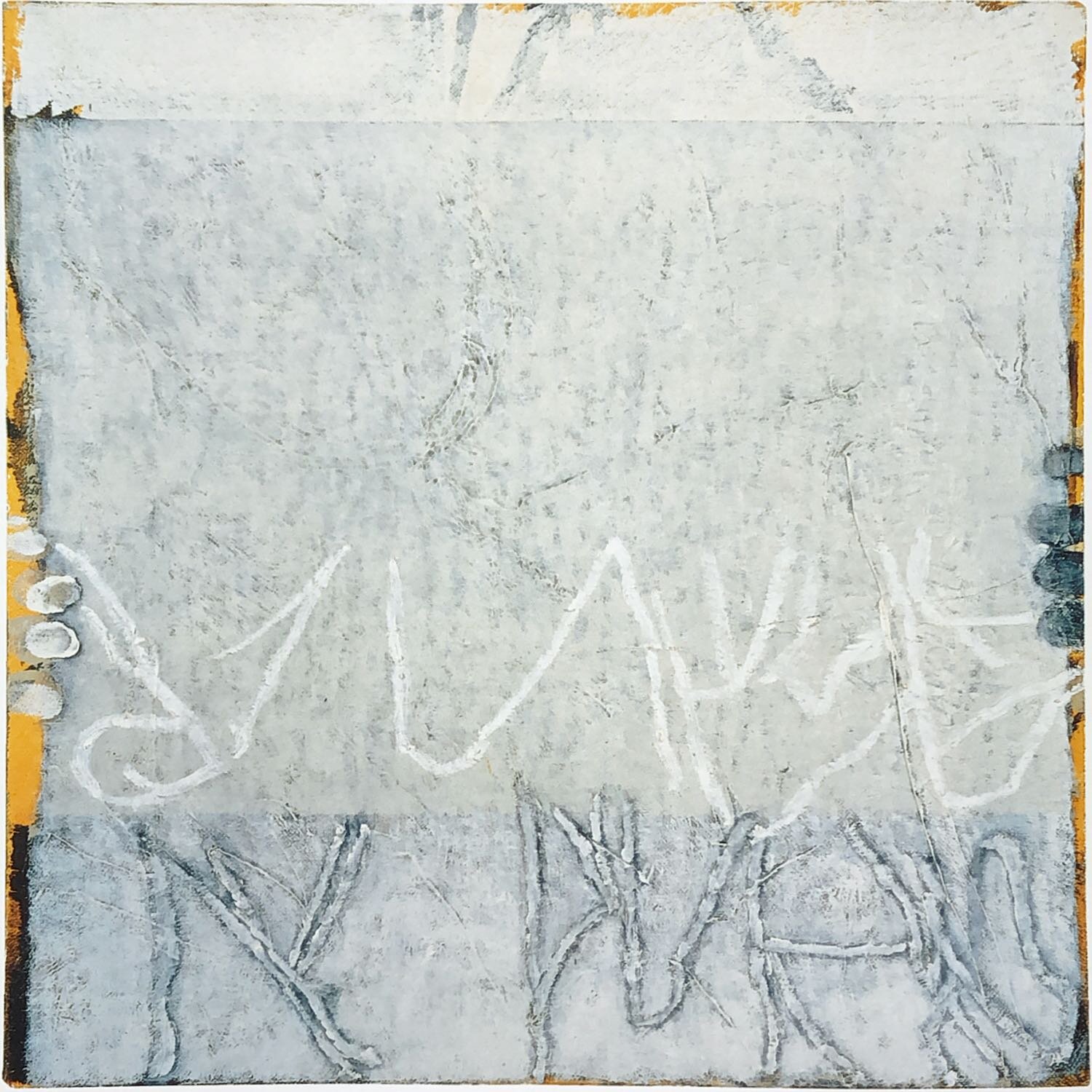
Warren Rohrer, Untitled, 1992, oil on linen, 16 x 16 inches
A deeper level of my understanding and relationship with Warren’s work came in 1998, when I saw for the first time (and contemplated maxing out my credit card to buy) a smaller untitled work made in 1992. Warren’s paintings typically feel very “frontal,” by which I mean the physicality of the paint and color, particularly in his larger works, seems to push outward from the surface that hangs vertically right in front of you. But this intimately scaled, untitled painting demonstrates a more illusionistic sense of space. The dominant bluish-grey color functions as a screen in front of what seems like a yellow/orange environment behind. Warren’s landscape-glyph gestures are both obscured by this screen and applied on top of it, possibly drawn with oil sticks rather than painted with a brush. Warren’s wife, Jane Rohrer, later told me he often experimented with a wide array of mark-making devices, including doing things like scratching through layers of paint using artificial press-on fingernails.
This painting conspicuously includes a rare mark in Warren’s work: his own fingerprints appearing along the right and left edges of the canvas. Here it is as if Warren is standing behind the painting, arms extended, holding it out to show us. Both artist and viewer become part of the painting. Warren wrote and spoke of the idea of inviting the viewer in partnership with him to experience his work. In this case Warren explicitly paints the invitation. Seeing this particular work as I did in one of the top commercial galleries in Philadelphia, and again a few years later in an exhibition at the Philadelphia Museum of Art, I experienced it as conveying a powerful sense of generosity. Whereas often the viewer is expected to “go to” or to “encounter” the artwork, Warren instead makes this painting do the opposite. It appears to offer itself to you. I carry the memory of this work forward in my own work, occasionally including a fingerprint or fingerprints along an edge of the image.
Warren showed me how beautifully plain you can be with a painting. “Make the way as narrow as possible for yourself, but as broad as possible for everyone else.” This Zenlike phrase was relayed to me in the late 1990s by a Mennonite friend of Warren’s generation. I was told it was a bit of advice given to her father when he was ordained as a pastor of a Lancaster County Mennonite congregation in the early 1950s. When I heard this, I immediately thought of Warren, who by the early 1950s was himself transitioning away from becoming a Mennonite pastor to becoming a secular painter. Either way his life path took him, this could have been his mantra.